Coinnect
Passion Project, 2024
Overview
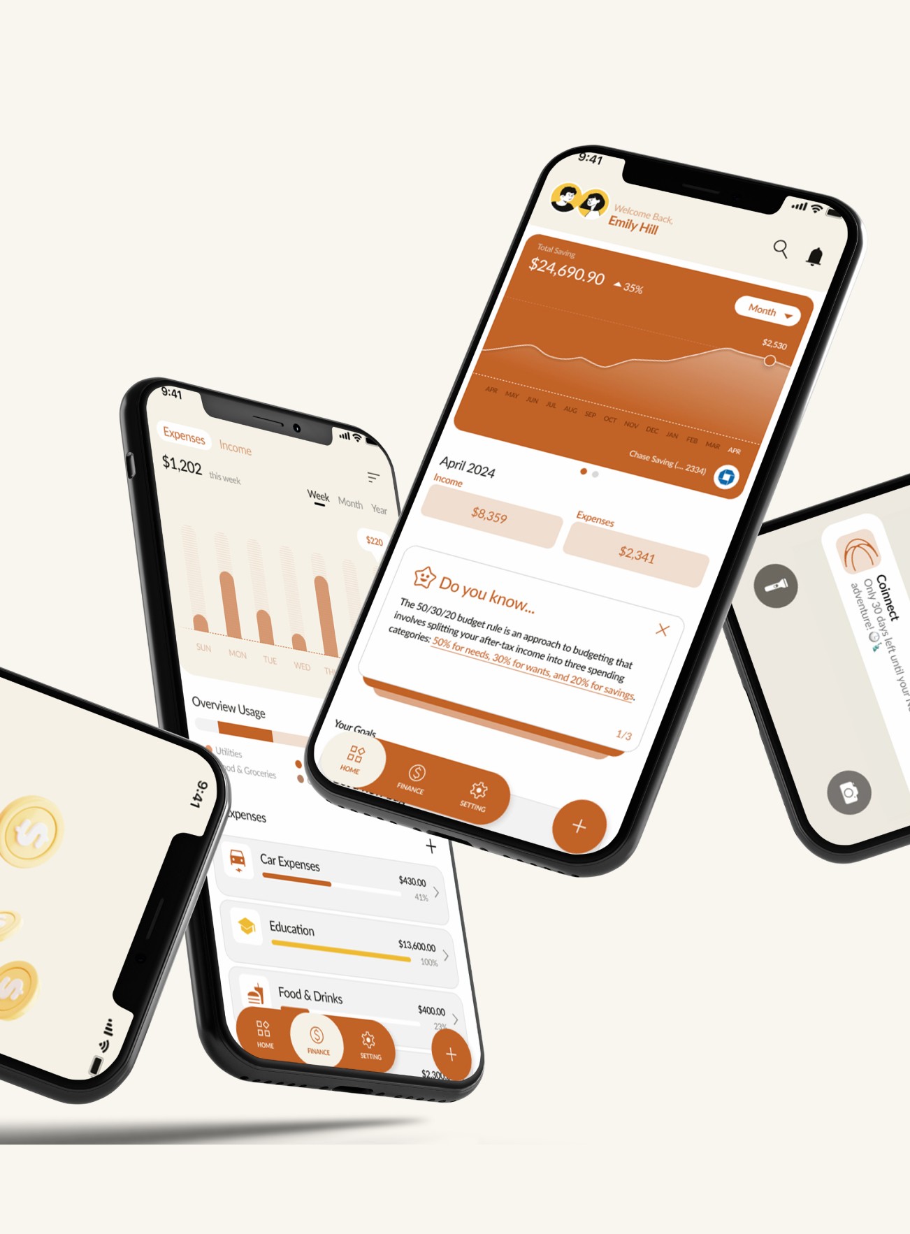
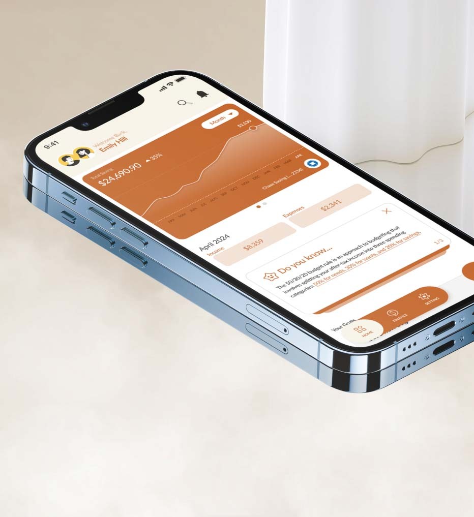
Coinnect is a dual financial management for couple to establish a financial communication ecosystem that fosters stronger couples’ connections, improves coordination, and enhances the overall well-being of families.
Highlight
The Problem
What Impact to Couple's Financial Health?
In a study on financial issues, the main question was: 'What factors contribute to the rise in financial struggles among the general population?' The research aimed to uncover the root causes of these challenges and identify key variables influencing economic instability. By examining relevant data and evidence, I sought to highlight interconnected factors affecting financial well-being and provide insights for addressing these concerns.
41% of Americans say money was a big source of tension in their households in 2022; financial problems are a leading cause of divorce.
“Marriage is a union of love, but it’s also an economic arrangement.”
Research
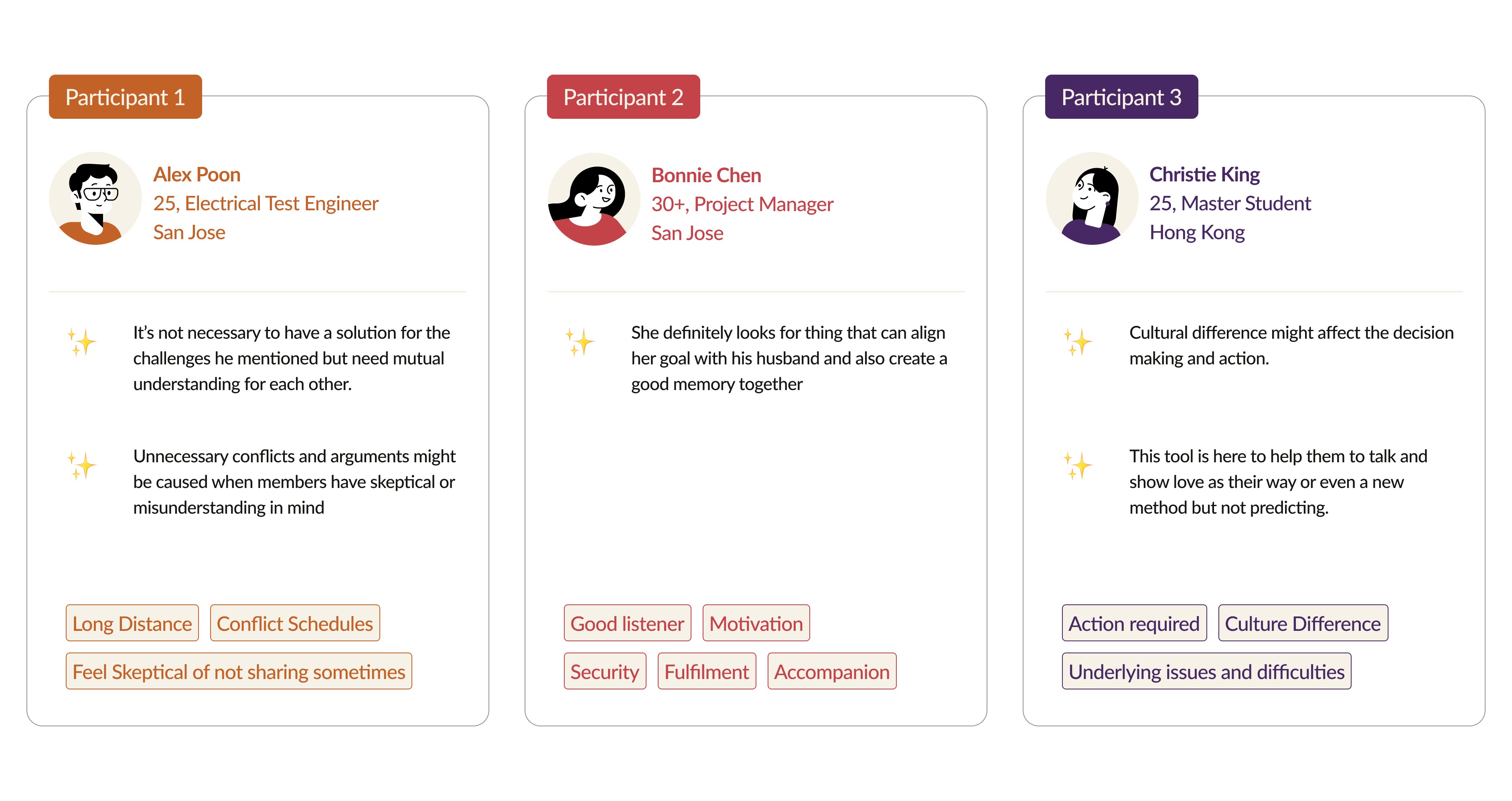
Conducting Interview
My Concept
Coinnect is a dual financial management for couple to establish a financial communication ecosystem that fosters stronger couples’ connections, improves coordination, and enhances the overall well-being of families.
How to make revenue:
We offer a basic version of the app for free and charge users a monthly or yearly fee for premium features (advanced financial analytics, personalized financial advice or increased security measures)
We would also partner with financial institutions, insurance companies, or financial advisors to offer products and services directly through the app.
Meet Emily
Based on the survey and interviews, I created a persona Emily and outlined her behaviors and financial habit with her partner briefly.
Design Process
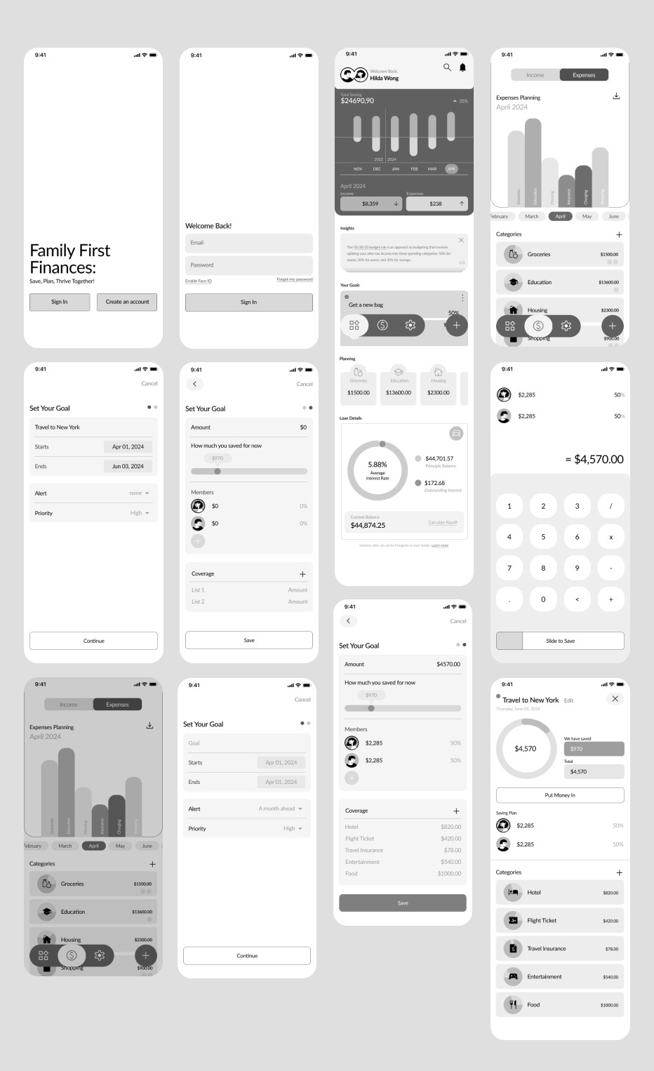
Low-Fi Wireframe
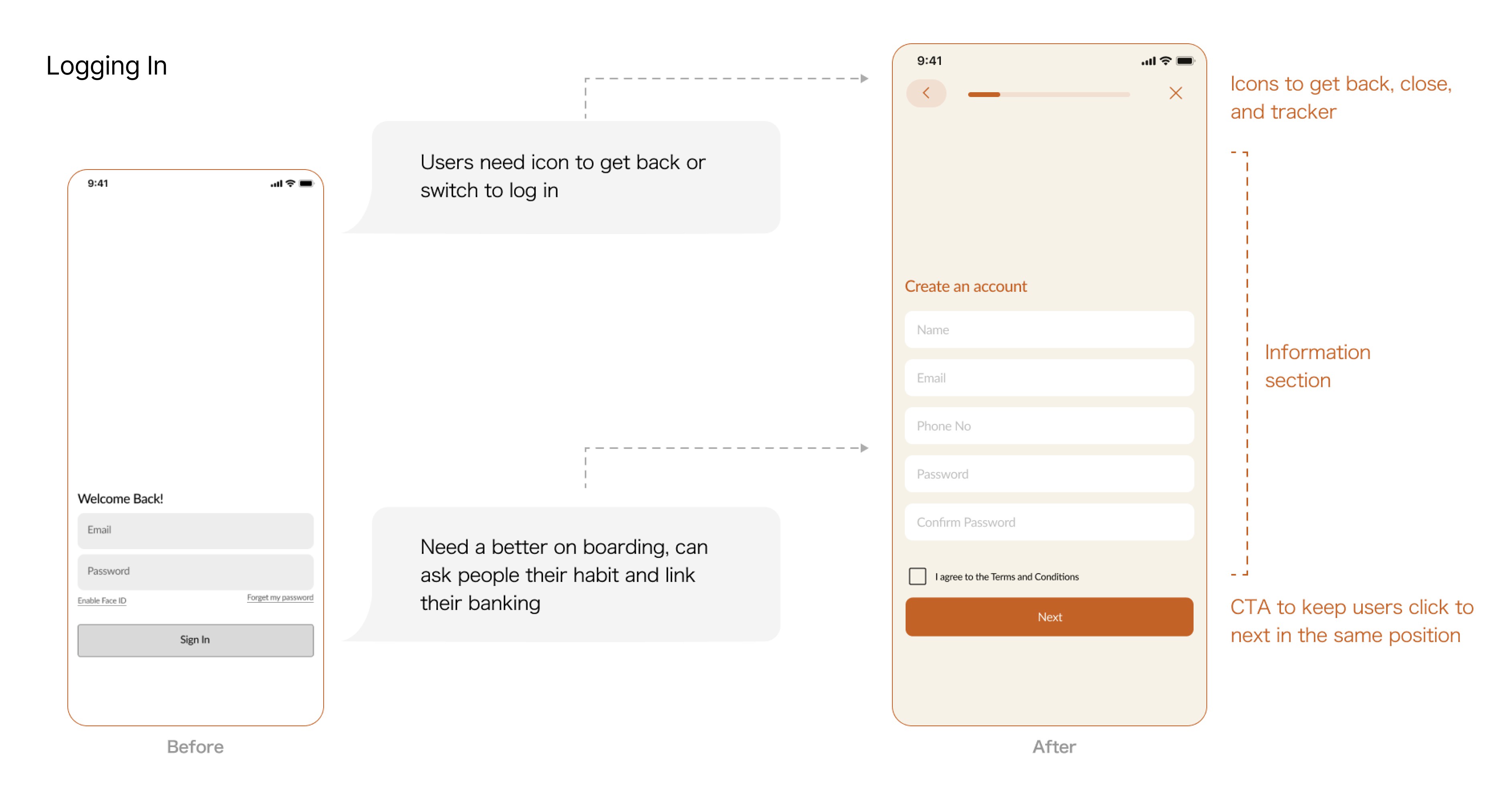
I built a wireframe and conducted usability testing to assess user experience, gathering valuable insights to enhance the design and functionality further. My proactive approach ensures that user feedback is incorporated efficiently, making informed decisions for improving the overall usability of the product.
1st Usability Testing
After conducting my first round of usability testing, I refined the design based on the feedback gathered from the users. The iterative process helped enhance the user experience before finalizing the product.
Like:
Analytics keep partners accountable
Goal-making helps both users have a clear plan
Allow users to be more mindful of how they spend money and plan where their money goes
Can see themselves using the app!
Wants:
Color to help differentiate the highlights
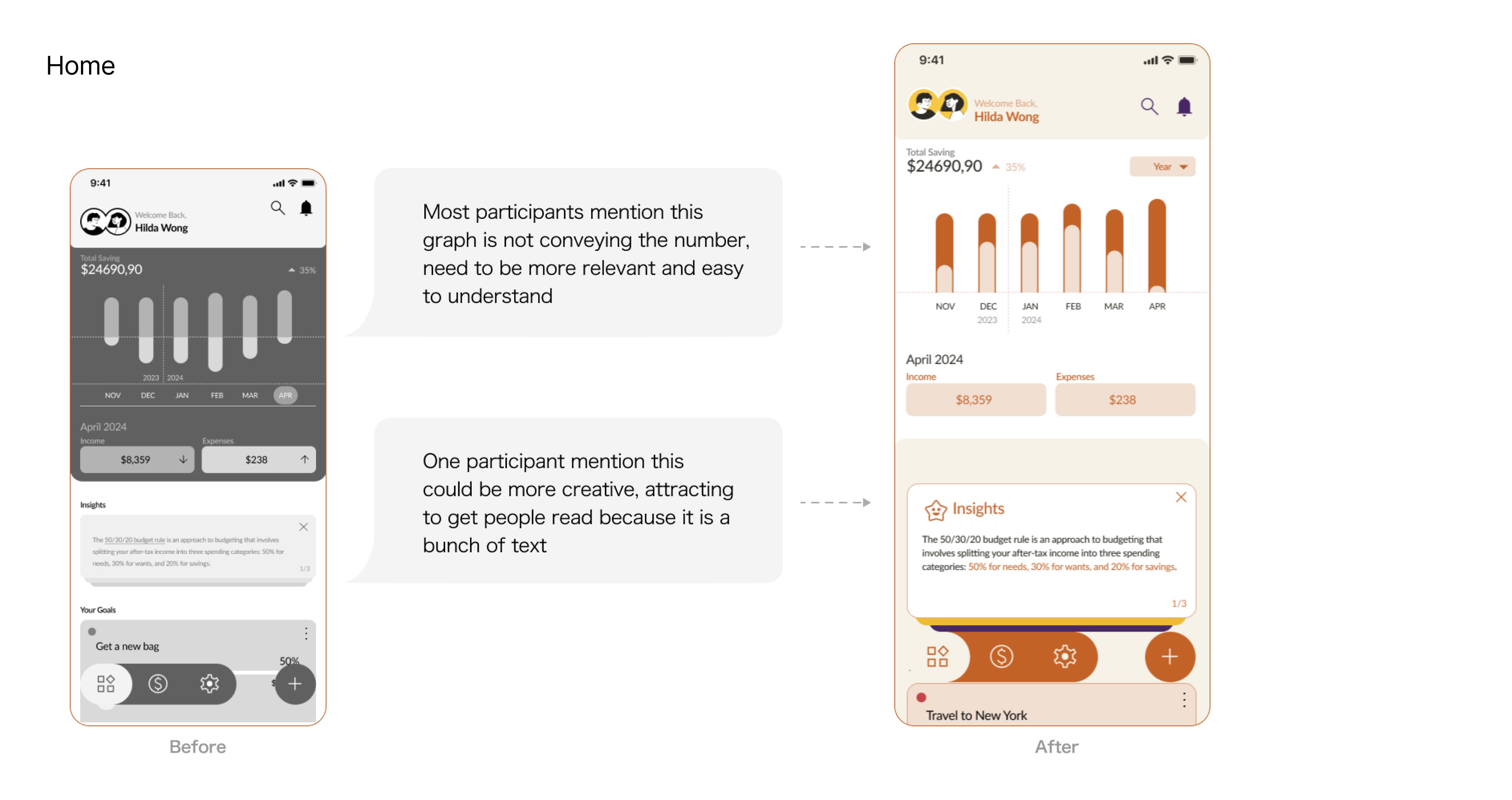
A better graph to conclude their financial status
A reminder to track their goal process
Focus on Financial transparency with partner
It is crucial for a couple's financial app to build trust and open communication. The app should include features like real-time expense tracking and shared financial goals. Regular financial check-ins can further enhance transparency and collaboration.
Self asking:
What kind of financial stress people would have?
How to improve their financial habit based on their needs?
How to manage the possibility of owning multiple joint accounts?
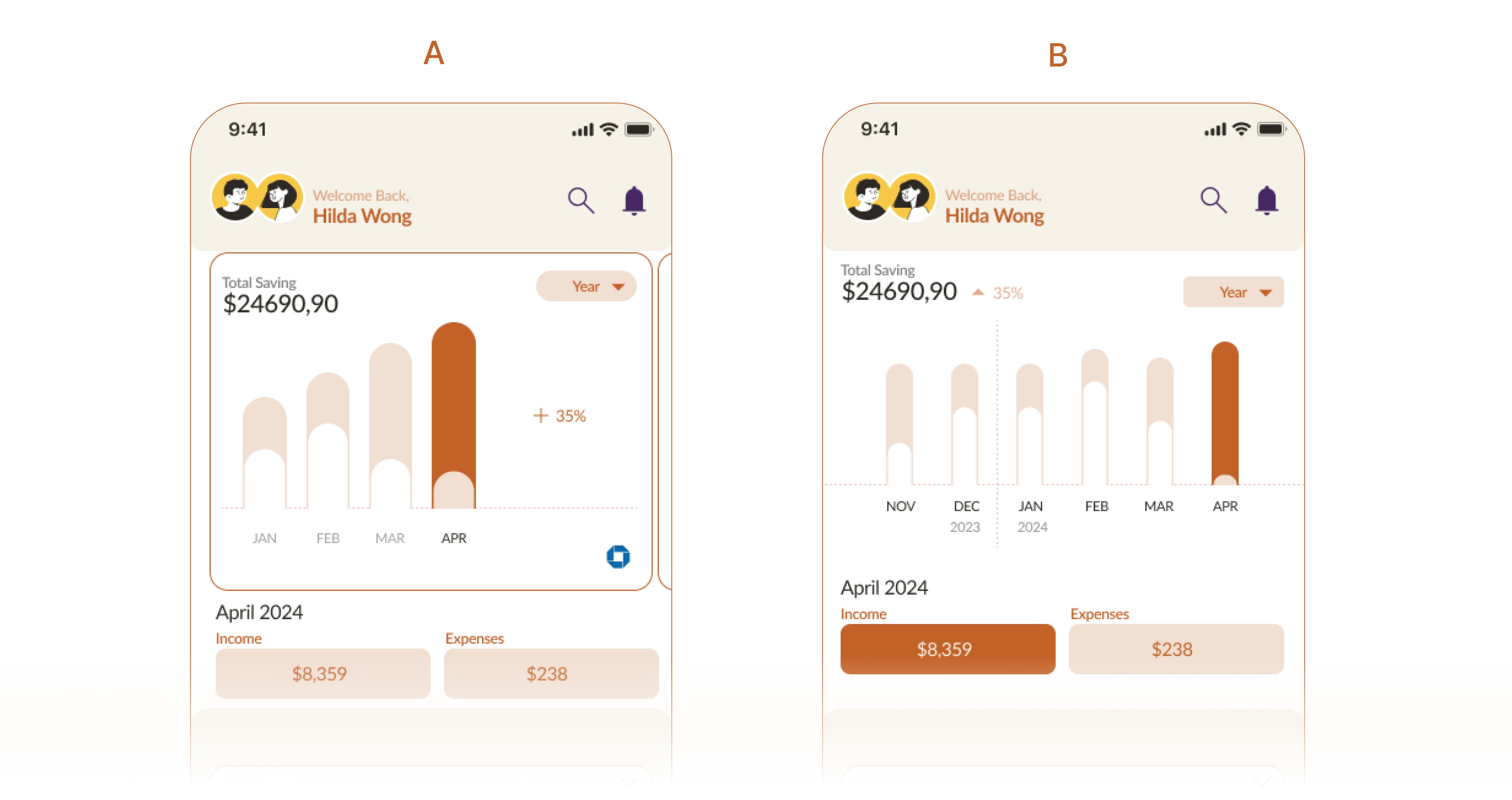
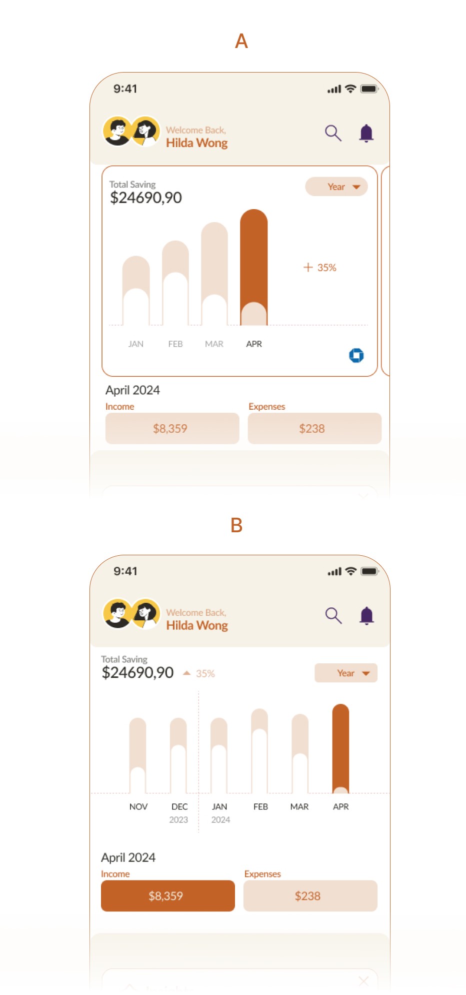
More people prefer Design B
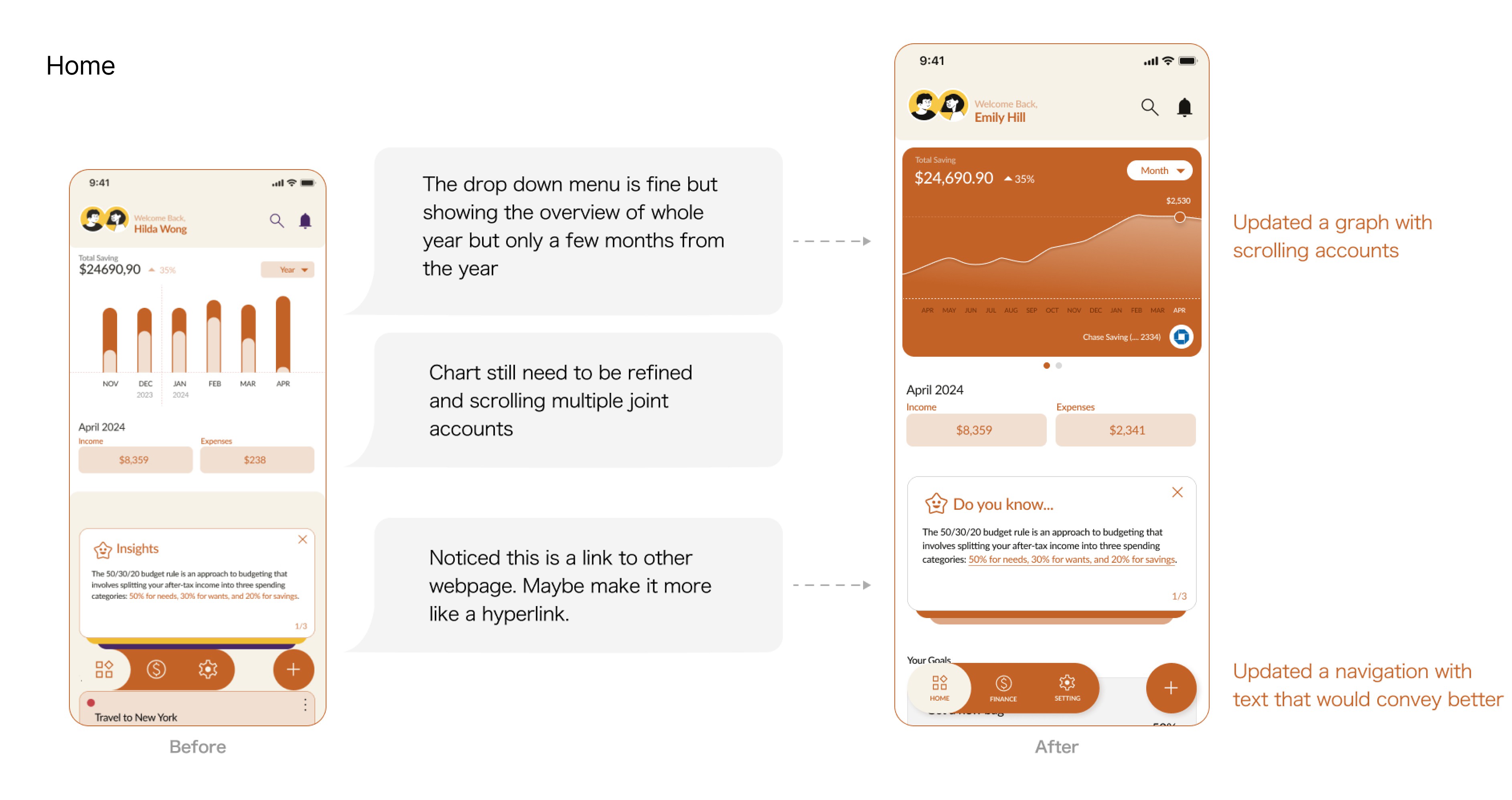
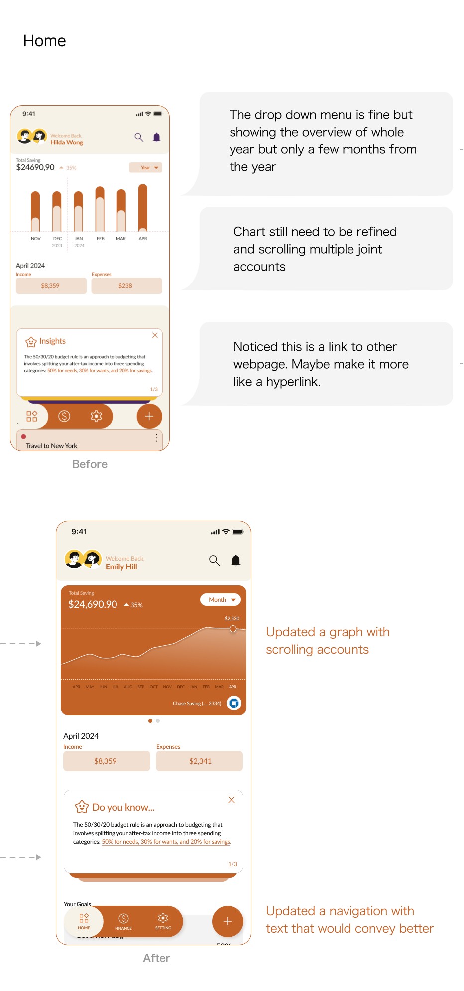
Creating a crucial chart became a challenge and I encountered a roadblock. Hence, I opted to perform a brisk A/B comparison to determine the design direction I should pursue, and comprehend how individuals interpret a bar graph during the test.
Like:
Bank logo with account details, make it more clear which account info they are reading
Swiping widgets help users understand the swipe function
Dislike:
The growth percentage is confusing and has unclear placement
The dropdown menu should display the full data as the title
2nd Usability Testing
I focused on identifying the key details and elements that help users achieve their goals by observing interactions and gathering feedback. This feedback will guide targeted improvements to enhance user satisfaction and product usability.
Like:
Aesthetics, colors
Grouping similar elements makes it easier to find and access related features quickly
The acknowledge section educates users that they show curiosity
Wants:
A better hierarchy on graph reading
Editable categories
Shortcut to action
Quick screen & second click
I discovered that users prefer reading graphs for quick information and don't mind a second click for more details. Additionally, users valued the AI assistant for streamlining processes and offering personalized recommendations.
Self asking:
Are the graphs and charts telling the story and how does it clear to users?
What haptic feedback they would receive for second click?
Design Identity
Logo
My aim is to craft a visual element that impacts users. Precision is key when selecting the color palette, typeface, and visuals that best represent the app's intention. The moniker "Coinnect" is a fusion of "coin" (finance) and "connect" (collaboration). By keeping the users' viewpoint at heart, my goal is to design a logo that embodies trustworthiness, dependability, and novelty.
Color
I envision Coinnect as a platform that fosters safety and professionalism, ensuring a sleek, reliable experience. Its calming hues create a serene environment, promoting steadiness as users navigate the app with their partners.
Typography
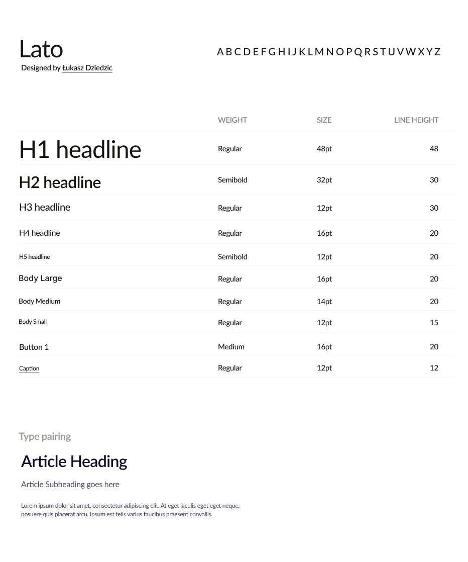
Lato is known for its modern and clean appearance, making it a popular choice for digital design projects. With its wide range of weights and styles, Lato is suitable for various applications, from body text to headlines.
Component Library
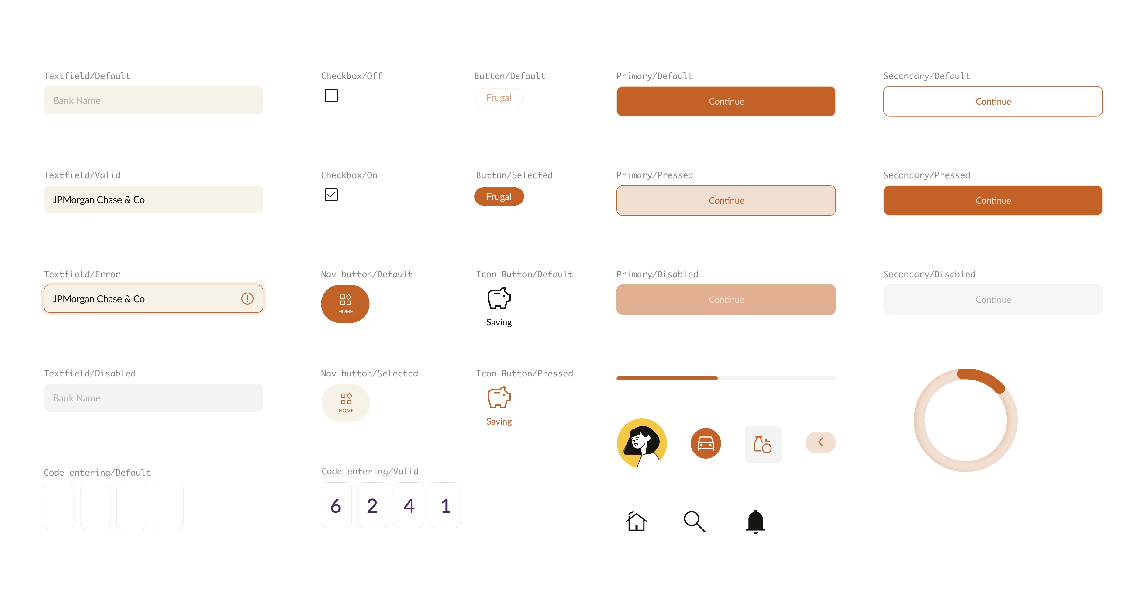
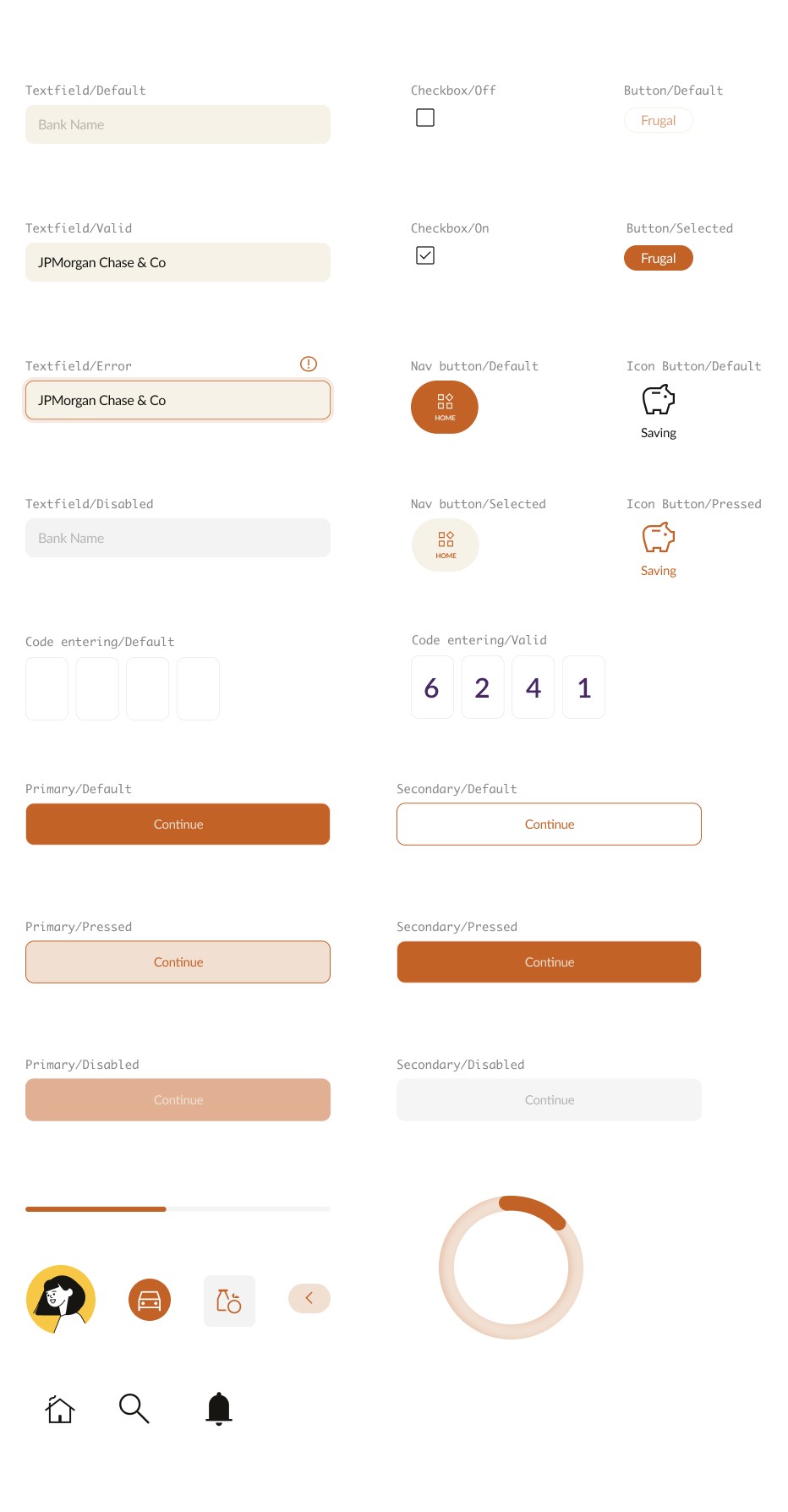
I built a comprehensive collection of reusable UI elements for building user-friendly interfaces. Our components, including buttons, forms, and cards, are designed to be clear, easy to follow, and intuitive. They are also simple to customize and seamlessly integrate into the Coinnect app.
Final Design
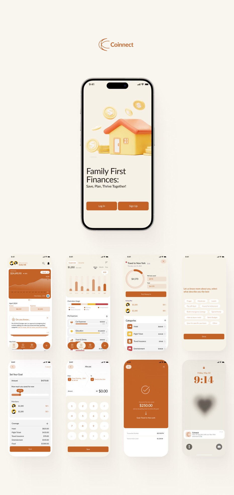
Effortless Financial Management
Track Expense and Income with Ease
Achieve Dream Together
Set and Track Goals with Your Partner
Countdown to your dream goal
Keep saving, stay focused!
Takeaways
Coinnect shaped my approach to solving real-world financial challenges.
Completing the Coinnect project in three months was a rewarding journey. As someone interested in managing finances with a partner but don't know an efficient way, I can see myself using this app and helping others like me. Through this case study, I gained valuable insights into how people handle finances and their habits, thanks to usability testing. It deepened my understanding and provided a tool to support others on their financial journey. I loved engaging with users, discussing improvements, and finding what truly helps. I see myself as a "design doctor," crafting user-centered solutions for real needs.
What to improve:
Live Chat with Financial Expert
This feature allows users to connect directly with certified financial advisors in real-time for personalized advice and support. Whether you need help with financial questions, here to provide tailored guidance and ensuring you make informed decisions with confidence.
Spending Tracker for their Goal
Complementing our goal planning overview, this page allows users to monitor their actual spending against their budget. Easily track expenses, categorize spending, and adjust plans to stay on target with your financial goals.

